Sometimes, shoppers already know what they want to buy — and when they want it.
A prime example is buying flowers for Valentine’s Day, says Katie Hudson, content director at online flower retailer UrbanStems.
UrbanStems sells about five times its typical volume in the week leading up to Feb. 14, Hudson says. During this week, a large share of UrbanStems.com browsers are looking to buy and will convert on any page on UrbanStems.com, even the pages without the conversion-driving features the retailer added to help with year-round sales, like a countdown timer.
“The week of Valentine’s Day, the intent to purchase is so high that we’ve seen — and we’ve tested this a few times — we’ve seen people convert better on our normal shopping experience for that week because they don’t even need to know our story,” Hudson says.
But when online shoppers aren’t converting as well as retailers would like, merchants must determine what data they can use to guide shoppers to the right products. They also must identify improvements they can make to their site experience to lead shoppers to convert. Improving conversion rates is an ongoing process. Four retailers share how they’ve improved their web experience and marketing tactics to boost their conversion rates, such as by creating a faster checkout page and surfacing more engaging on-site search results.
64% of retailers said they improved their conversion rates in 2022 compared with 2021, according to a Digital Commerce 360 retailers survey of 73 online merchants in February 2023. Additionally, 22% maintained their conversion rates year over year, and just 14% had declining conversion rates. Most retailers surveyed had conversion rates of 1.51% or better.
Better than “normal.” Enhanced site tools are conversion drivers
UrbanStems is always monitoring its conversion rate, and it continually tests design features to improve conversion, Hudson says.
The “normal shopping experience” on UrbanStems.com is the baseline pages running on Salesforce’s ecommerce platform. UrbanStems also runs design feature experiments using web design vendor Zmags’ Fastr Frontend interface, which connects to the platform via an application programming interface.
The vendor allows Hudson to add new pages or custom-designed sections of pages to UrbanStems.com that aren’t limited to its ecommerce platform’s template, rather than submitting a ticket to the retailer’s web developers each time she wants or needs to make a change.
Some of those changes include adding a countdown timer, updating promo codes in real time, and the use of an inventory badge that indicates how many units of a product are available. Each change helped UrbanStems improve its conversion, Hudson says.

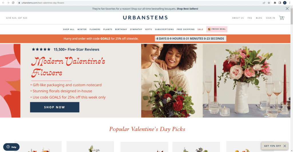
UrbanStems created a specific landing page with a countdown timer for Valentine’s Day for shoppers visiting the retailer after clicking on a Facebook or Instagram ad.

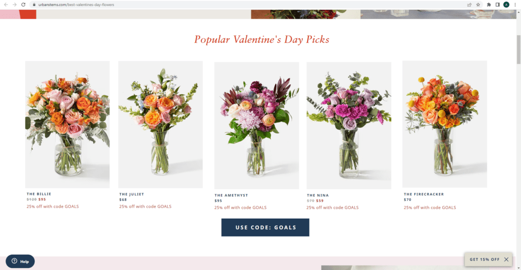
The UrbanStems website shows shoppers flower arrangements with the highest conversion rate first.

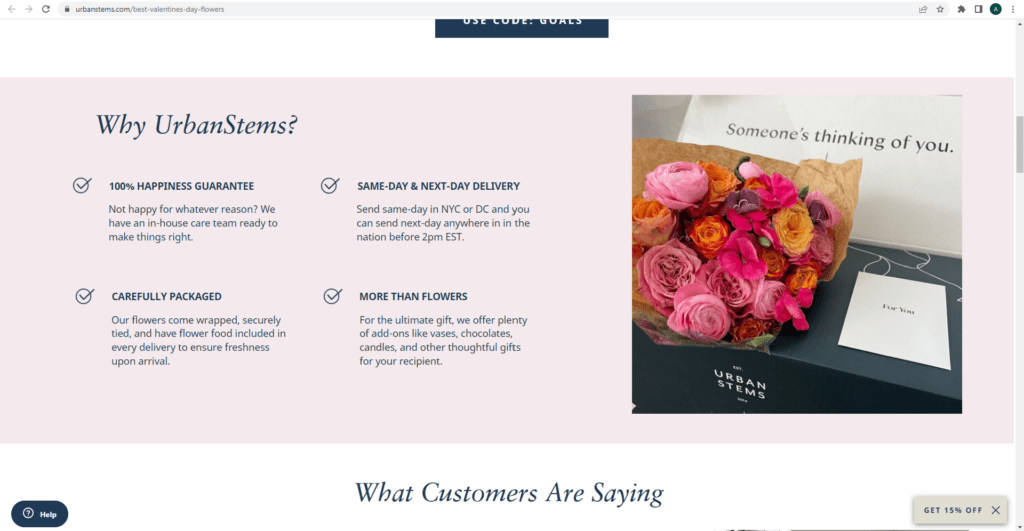
Flower retailer UrbanStems shows shoppers visiting from Facebook and Instagram marketing language for shoppers unfamiliar with the brand.
When UrbanStems tested a Zmags landing page versus its normal shopping product listing page, the Zmags landing page always had a higher conversion rate compared with the normal shopping page, Hudson says. Now, she tests one Zmags frontend page versus another to see how well different creatives lead shoppers to convert.
In addition to using Zmags, UrbanStems also uses Contentsquare, a digital experience analytics platform, to gather additional shopper data. Contentsquare offers a heat map that allows Hudson to see where shoppers are clicking on UrbanStems.com.
“Are people clicking more on this orange bouquet that’s $70, or are they clicking on this pink bouquet that’s $70?” Hudson says, adding that she tries “to get a sense of where people are gravitating. If we’re seeing a super-low clickthrough rate, we will update the creative in some way. Overall, we’re always monitoring conversion rate.”
Got a hunch? Time to test new features
Valentine’s Day accounts for a large chunk of annual revenue at UrbanStems. But outside of peak seasons, Hudson tests pages and market products based on hunches and trends.
One test Hudson conducted was based on delivery dates. Many of the products on UrbanStems.com are tied to a particular delivery date. Because of that, shoppers might see that certain bouquets are unavailable until a week or two after the date they browse the website. If a bouquet is unavailable, it automatically gets pushed down on the UrbanStems product listing page. But Hudson had a hunch that shoppers might not be as concerned with the delivery window. If that were true, the retailer could show top sellers at the top of the listing page regardless of the availability date, rather than expecting shoppers to scroll to the bottom of the page to find them.
“You might come to one of our landing pages and then see the peony bouquet, and then you can click it and be like, ‘Oh, I can’t get it until Feb. 21,’” Hudson says. “But what we tested was even if that was the case, we were driving a higher conversion on the landing pages where we were not tying our inventory to delivery date. It was allowing us to put the best-looking bouquets or the top-selling bouquets front and center.”
Displaying prices with discounts included spikes conversion
Wow Skin Science also added new features to its site to help with conversion. The personal care brand noticed shoppers were leaving at checkout after adding items to their carts, says Sudeep Bansal, vice president of growth.
After surveying shoppers, Bansal discovered shoppers expected their promotions to be applied to their cart before checking out. When they didn’t see the promotion applied before checkout, they would abandon their cart — and they wouldn’t return to it.
“So we introduced a widget in the cart where the offer that’s available for the customer is visible, loud and clear,” Bansal says.
“The customer could just apply that offer and move forward in the journey. We saw a significant delta in conversion rates for that,” Bansal says, declining to share the retailer’s conversion rate.
To further improve the customer experience, the site autofills a shopper’s address during the checkout process. It also provides easy navigation on the homepage so shoppers can get to the products they want quickly.
“One challenge we see is there’s too much information available on the internet today,” Bansal says. “When people come on our site, they get confused on what they want to buy. We have about 500 different SKUs listed on the site, and when the customer comes in, the customer doesn’t really know what is the right product for [them].”
Wow Skin Science alleviates this with its beauty quiz. It asks shoppers for information such as:
- Age
- Skin type
- What scent the shopper prefers
- What the shoppers’ concerns are
After finishing the quiz, shoppers receive a personalized suggestion of individual Wow Skin Science products to try as well as skincare kits. Conversion rate is higher on personalized product suggestions shoppers receive after taking the quiz, Bansal says. He attributes the increase in conversion to shoppers trusting that the suggested products will work for them. Shoppers are also given the option to automatically filter the website’s product listing page based on what the shopper filled out in the beauty quiz.
Don’t make it hard for a customer to give you money
Wrist Mafia also noticed shoppers were abandoning their shopping carts. It improved its conversion rate after optimizing its landing pages and improving checkout speed, says CEO and founder Johnny Brown. Wrist Mafia is a subscription-based retailer that allows customers to receive a new watch. The subscriptions it offers are monthly, every three months, bi-annually or annually.
Wrist Mafia’s previous interface, ReCharge, made shoppers leave the retailer’s Shopify-hosted site to complete the payment process. ReCharge had a separate processor and application built on top of Shopify, rather than an interface that integrates directly into the platform, Brown says. Shoppers couldn’t use Shop Pay or Google Autofill forms during checkout, which decreased conversion, Brown says, without sharing specifics.
“If you have to go through six pages to check out, you’ll lose most of those customers,” he says. “We did.”
Wrist Mafia’s customers can now check out in less than 10 seconds, he says, down from two to three minutes. That checkout speed improved after the retailer implemented subscription-management vendor Ordergroove’s interface in September 2022. Ordergroove helped reduce the number of pages shoppers had to navigate to subscribe by three pages, Brown says.
And to acquire new subscribers, Wrist Mafia heavily discounts the first watch in the subscription, Brown says. That discount for the first watch is the best available price other than during the Cyber 5. Cyber 5 refers to the period from Black Friday through Cyber Monday.
This conversion-driving tactic also helped Wrist Mafia grow to about 11,000 subscribers at its peak in early 2022, up from about 2,000 subscribers at the beginning of the pandemic.
Within three months of implementing Ordergroove, Wrist Mafia grew its subscriber base 63%. Its subscribers can pay monthly or prepay for three- or six-month subscriptions.
UrbanStems, Wrist Mafia and Wow Skin Science all share a similar theory in their approaches to improving their conversion rates. Make it easy on the shopper. The three merchants have improved their conversion by improving the shopper experience. And they did that by making it easy to find products and pay for them.
Read more
This is part of Digital Commerce 360’s March 2023 Strategy Insights edition. Our members have access to all the articles in this month’s issue, Data-Driven Retail.
Favorite