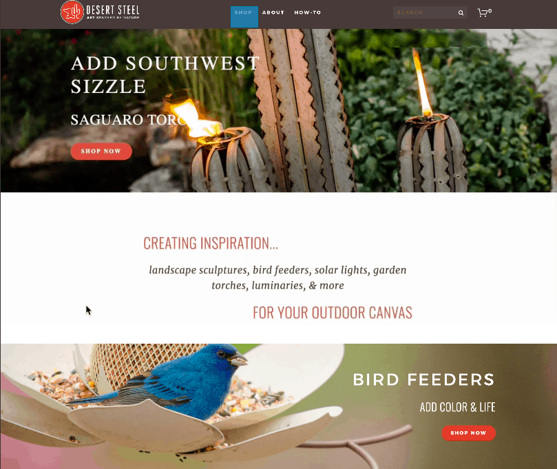
Desert Steel, an e-retailer of garden art and sculptures, sought web design guidance at last year’s Open Mic Feedback Forum workshop at the Internet Retailer Conference & Exhibition in Chicago. The interactive workshop provided a 101 course-level guide to the key elements of ecommerce site design.
And this year, Jason McClintock, president of DesertSteel.net, was back to share his vastly improved website at the session titled, “Usability: Keeping Shoppers on the Road to Checkout, Step by Step.”
Desert Steel revamped every part of its website, from the homepage to the about page to the navigation, thanks to the help provided at the workshop, McClintock says. In its original state, the homepage featured uncommon cactus names (such as a “Saguaro” torch), birdfeeders above the fold and minimal navigation.

“When you go to this website, what do you think this retailer sells?” Scott Kincaid, chief success officer at research firm Usability Sciences, asked the audience at the Usability workshop yesterday. He also was part of the 2018 workshop.
“Birdfeeders,” one person in the crowd answered.
While Desert Steel does sell birdfeeders, that’s just one category of its vast product offerings, which include torches, fire pits, lighting and sculptures of cacti and succulents. Now, its homepage more prominently features the cacti sculptures, along with a more robust navigation.
Thanks to these changes and more, Desert Steel had a 225% increase in revenue in 2019 compared with 2018—from $105,000 to $350,000, McClintock says.
In addition, Desert Steel had a 260% increase in orders and its conversion rate climbed from 0.15% to 0.25%. And its traffic spiked 350%, from 150,000 sessions to 685,000 sessions year over year.
“In my experience, some of the best insights come from peers helping peers, in conversations that happen at the lunch table, after the sessions and at happy hour,” Kincaid said at the workshop last year. “This workshop fosters this type of environment.”
